Sunday, May 1, 2011

Week 15: The Final Cut

Business Card


LOGO
Poster Design

Webpage Number 1

Webpage Number 2


Welcome to the final feature. This week we are finishing up 2D designs with a organization or a group cause of our choice. I chose to go with the Horror Film Festival Organization. The challenge this week continued with the restriction of not using any black or white color in our final products. Also we were required to design a business card, logo, and our choice of building at least two webpages, or perhaps a CD album. I chose to go with two webpages, which were really fun to build. The ideas were flowing from the brain pan like mad! This was a fun way to end the semester! I truly hope that you enjoyed my blog post throughout the past 15 weeks!

~Haunted Blessings~

Mandee

Monday, April 25, 2011

Week 14: Poster for a Cause

This week we were challenged to choose a group or cause that we care about, and create a poster using any color we deemed necessary to get our message across, (excluding any black or white values of course). This was quite the challenge for me because my world revolves around dark and Gothic art...aka black. So with that said I still decided to go with one of my favorite organizations called the Horror Film Festival or often referred to as the Inernational Horror Film Festival or IHFF / HFF). The Horror Film Festival makes it possible for inspiring horror artists and movie makers to share their views and creations with those with similar interests... or those who just what to get the crap scared out of them. Mahaha... (Yeah that was my poor excuse for an evil laugh). Anyway, the Horror Film Festival is held all over the world each year, usually sometime in October. This years fest is supposed to be held in Louisville Kentucky. It is a little early this year hitting in mid-July. It's supposed to be a scream! Hope you enjoyed my creation!!

Sunday, April 24, 2011

Week 13: Color


Well it took me a long time and most of the week to ajust colors to get what I believe to be the perfect color wheel. Now that I am FINALLY finished with it it kind of reminds me of one of those paint samplers you can find at the local hardware store! :) Yeah Colors! Also we were to take a color test online. I scored a 32. Haven't decided yet if that's a good thing or not.

Friday, April 15, 2011

Week 12: Value


This week we were asked to make a self-portrait in black and white value with the materials that we scanned in week 10. I ended up using my swatches that consisted of paper towels, a wrinkled shirt, a swirly pillow cover, pin-striped pants, pillow button for the eyes and couch fabric for the shirt. Also we had to create something that was a representation of who we are as a person. I like the goth scene so I had to go with the darker lips and the "Liquid White" paper face! :) Hope you enjoy it!!

This was the original pose I chose to go with and adapted as necessary!

Sunday, April 10, 2011

Week 11: Illusion of space & movement

Illusion of Space:


Size: Here is a Mass Media Advertisement that show cases even at the smallest of sizes art, logos and so on can have a big impact on the little people.

Photo retrieved from: xtimeline.com

Size: The size of this butterfly ontop of the glass flower shows the illusion of space. With the blurred background it only ads to the depth or the weight of the composition.

Photo retrieved from: coloribus.com

Exaggerated Size: In this mass media ad we have an Exaggerated size bottle of soda compaired to the model. This fits the illusion of space perfectly.

Photo retrieved from: japannwbied.com

One Point Perspective: There are quite a few differnt line placements in this one point perspective that could also suggest movement.

Photo retrieved from: adcipher.com

Illusions of movement:


With the Anticipation Motion of blood spraying out of the phone, it gives the composition a feeling of movement. Plus the blurring of the surroundings as well as the photo on the wall it successfully aids that illusion.

Photo retrieved from: dreamfactoryblog.com


The digestive track really give the impression of movement. With the lining of the stomach acting as a road, this is a perfect illusion of movement.

Photo retrieved from: adsoftheworld.com

Transient Illusion: By using the clothing in the middle it ads movement almost effortlessly. The active movment between ninja and model also adds to the effect.

Photo retrieved from: blogger.com

Multiple Image to suggest the Illusion of movement. This photo was shot for a Browns University Photography Department ad. By shooting this photo with the correct shutter speed, the indication or the illusion of movement was successfully imployeed.

Photo retrieved from: news.browns.edu


Sunday, March 27, 2011

Week 9: Shape & Volume


This week we learned about shape & volume. We were asked to use a chair with another object like a plant and design a balanced picture in the Negative sense. I saw these couple of vintage wheelchairs while I was in Burlington this weekend and decided to use them for this project. Also I saw these interesting plants at the hotel I stayed at and decided to incorperate them in as well. Hope you like it.

Sunday, March 20, 2011

Week 8: Line Drawings

Part One: Dry Media

Part Two: Verb - Wet Media
Part Three: Line Drawing Dry Media

Part Four: Line Drawing - Wet & Dry Media


Monday, March 7, 2011

Week 7:Mid-Term Head Shot

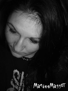
I chose to use this photograph for this week's portrait assignment because I feel that it is an exact replica of who I am as a whole. Artistically speaking, I am the overall focal point of the photograph. With all that said, to be honest I actually like this portrait of myself because it's dark, unyielding and yet some what mysterious. It has a dark and grotesque feel to it being that it was shot in black and white. Achieving a grotesque feel was accomplished by having so many different shadows making it appear that my head is larger then my body. Also, this photograph exhibits a few of my personality traits, such as how shy I can be or how I am actually a very quiet person. This pose indicates how I tend to keep to myself a lot of the time. I can just be thinking about things or nothing at all. I like the feel of isolation in my life sometimes just to ponder on some of the darker aspects of the macabre world, whether that means vampires, zombies or the undead in general remains to be unseen. I enjoy things that are jagged or chaotic in the art spectrum, things that sometimes are at a imbalance, hence the Slipknot t-shirt. The jagged writing exhibits the imbalance. I also enjoy skin art such as tattoos, hence the stars on the face. I do have the need some days to have a good balance in my life and that can be viewed here with the my silver necklace, which as a bit of repetition feel to it. Overall I feel this was the best photo to describe who I am as a person. Dark, mysterious, quiet, shy, kind and a little strange at times.

Saturday, March 5, 2011

Week 6: Fill Up Your Senses


This week we had to create a series of designs that are directly related to your senses. I chose to express sound. The goal was to create four designs that express this sense by using single words, one to express the emotional content through rhythm of each word. Then create a final fifth design inspired by your sense. Which emphasizes one type of rhythm either alternating or progressive. Since I have annual ear infections I figured I would express that rhythm with the above visuals. The first picture show everything is fine one day, the next I am super sensitive to loud noises followed by severe ringing in my ears. Pain is inevitable, then followed by at least three days of being deaf. There you have it! :)

Saturday, February 26, 2011

Week 5: Balance

Positive

Negative
The Left OversBalance Play


In this weeks assignment we were required to make a balanced image using things that we found in the kitchen. I used a clothes pin, a cookie jar, a pastajar and a wine bottle. This is what I came up with. Hope you like it! :)


Monday, February 14, 2011

Week 4: Scale

In this weeks assignment we're tackling Scale. We were asked to design a collage that integrates both scale and or proportion. The collage also has to have the feel of surrealism. I wanted to create a Light in the Darkness theme, that was also subject to cracks and decay. Beauty in the dark. I wanted to tie in the elements by having subjects like a decaying room, some light bulbs, maybe a lantern. This is what I came up with. I feel that I accomplished the Light in the Darkness theme I was thriving for by using the lantern as well as the light bulbs in a dark room. For the purpose of scale, I wanted to use different sizes when it came to the light bulbs so I intergrated them butterfly wings to show that diference. I also used a female model to ad a little drama to the photograph. Then I used some photobrushes I had made from Gaphic Design 2 to create a decay look. Credit for stock as follows: Notice all stock found below, I got permission to use their stock as long as I gave a address link to their sites. Thanks for looking!


http://pieceofmestock.deviantart.com (Lantern)
http://dyingbeautystock.deviantart.com (Female Model)
http://alegion-stock.deviantart.com (Background)
http://alegion-stock.deviantart.com (Lemon Butterfly)
http://porchstock.deviantart.com (Lightbulb)

Sunday, February 6, 2011

Week 3: Focal Points


Contrast: Color is often used to achieve emphasis by contrast. I chose this photo because of the dramatic play on contrast really pulls the eye to the main focal point: The Water Lotus. Photo retrieved from: www.fineartamerica.com

Isolation: Using a dark background with light on the focal point creates isolation. I chose this picture because it was dark, mysterious and most of all isolated. Photo retrieved from: www.fineartamerica.com

Placement: Many elements that point to one item, attention directed to achieve a focal point. I chose this photo because of the successful placement. Meaning the leaves climbing up the stairs has created many elements that point your attention to the main focal point. Photo retrieved from: www.fineartamerica.com
One Element: Visually overwhelming focal point. Strong visual emphasis that is usually found in magazines. I chose this photo for a couple of reasons. One I love this magazine, two the Gothic model is a very strong visual, and third she is just the perfect focal point. Photo retrieved from www.gothicbeauty.com
Absence of a Focal Point: Emphasize on the entire surface of the composition over any individual element. I chose this photo because of the continuation of an individual element. There is no real focal point to this photograph. www.fineartamerica.com