 This week we were challenged to choose a group or cause that we care about, and create a poster using any color we deemed necessary to get our message across, (excluding any black or white values of course). This was quite the challenge for me because my world revolves around dark and Gothic art...aka black. So with that said I still decided to go with one of my favorite organizations called the Horror Film Festival or often referred to as the Inernational Horror Film Festival or IHFF / HFF). The Horror Film Festival makes it possible for inspiring horror artists and movie makers to share their views and creations with those with similar interests... or those who just what to get the crap scared out of them. Mahaha... (Yeah that was my poor excuse for an evil laugh). Anyway, the Horror Film Festival is held all over the world each year, usually sometime in October. This years fest is supposed to be held in Louisville Kentucky. It is a little early this year hitting in mid-July. It's supposed to be a scream! Hope you enjoyed my creation!!
Monday, April 25, 2011
Week 14: Poster for a Cause
This week we were challenged to choose a group or cause that we care about, and create a poster using any color we deemed necessary to get our message across, (excluding any black or white values of course). This was quite the challenge for me because my world revolves around dark and Gothic art...aka black. So with that said I still decided to go with one of my favorite organizations called the Horror Film Festival or often referred to as the Inernational Horror Film Festival or IHFF / HFF). The Horror Film Festival makes it possible for inspiring horror artists and movie makers to share their views and creations with those with similar interests... or those who just what to get the crap scared out of them. Mahaha... (Yeah that was my poor excuse for an evil laugh). Anyway, the Horror Film Festival is held all over the world each year, usually sometime in October. This years fest is supposed to be held in Louisville Kentucky. It is a little early this year hitting in mid-July. It's supposed to be a scream! Hope you enjoyed my creation!!Sunday, April 24, 2011
Week 13: Color


Well it took me a long time and most of the week to ajust colors to get what I believe to be the perfect color wheel. Now that I am FINALLY finished with it it kind of reminds me of one of those paint samplers you can find at the local hardware store! :) Yeah Colors! Also we were to take a color test online. I scored a 32. Haven't decided yet if that's a good thing or not.
Friday, April 15, 2011
Week 12: Value
This week we were asked to make a self-portrait in black and white value with the materials that we scanned in week 10. I ended up using my swatches that consisted of paper towels, a wrinkled shirt, a swirly pillow cover, pin-striped pants, pillow button for the eyes and couch fabric for the shirt. Also we had to create something that was a representation of who we are as a person. I like the goth scene so I had to go with the darker lips and the "Liquid White" paper face! :) Hope you enjoy it!!


Sunday, April 10, 2011
Week 11: Illusion of space & movement
Illusion of Space:
Size: Here is a Mass Media Advertisement that show cases even at the smallest of sizes art, logos and so on can have a big impact on the little people.
Photo retrieved from: xtimeline.com

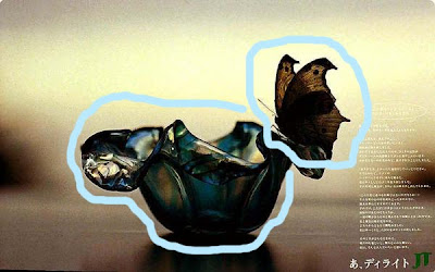
 Size: The size of this butterfly ontop of the glass flower shows the illusion of space. With the blurred background it only ads to the depth or the weight of the composition.
Photo retrieved from: coloribus.com

 Exaggerated Size: In this mass media ad we have an Exaggerated size bottle of soda compaired to the model. This fits the illusion of space perfectly.

 Exaggerated Size: In this mass media ad we have an Exaggerated size bottle of soda compaired to the model. This fits the illusion of space perfectly.
Photo retrieved from: japannwbied.com

 One Point Perspective: There are quite a few differnt line placements in this one point perspective that could also suggest movement.

 One Point Perspective: There are quite a few differnt line placements in this one point perspective that could also suggest movement.
Photo retrieved from: adcipher.com

 Illusions of movement:

 The digestive track really give the impression of movement. With the lining of the stomach acting as a road, this is a perfect illusion of movement.

 Illusions of movement:
With the Anticipation Motion of blood spraying out of the phone, it gives the composition a feeling of movement. Plus the blurring of the surroundings as well as the photo on the wall it successfully aids that illusion.
Photo retrieved from: dreamfactoryblog.com

 The digestive track really give the impression of movement. With the lining of the stomach acting as a road, this is a perfect illusion of movement.
Photo retrieved from: adsoftheworld.com

 Transient Illusion: By using the clothing in the middle it ads movement almost effortlessly. The active movment between ninja and model also adds to the effect.

 Transient Illusion: By using the clothing in the middle it ads movement almost effortlessly. The active movment between ninja and model also adds to the effect.
Photo retrieved from: blogger.com

 Multiple Image to suggest the Illusion of movement. This photo was shot for a Browns University Photography Department ad. By shooting this photo with the correct shutter speed, the indication or the illusion of movement was successfully imployeed.

Photo retrieved from: news.browns.edu


Sunday, April 3, 2011


Subscribe to:
Posts (Atom)